Attention
When you are logged in, beware not to move the boxes on other pages because your moves will be saved for the next visitor.
Please remove the files (image and audio) that you are not using anymore, because they take disk space.
CONTRIBUTING EDITORS
Julien Bruneau, Kristien Van den Brande, Tom Engels, Myriam Van Imschoot, Wendy De Pauw, Jeroen Peeters
Tom Engels
http://sarma.be/oralsite/pages/MoreThanOneTie/
http://sarma.be/oralsite/pages/publicationIJPADM/
Myriam Van Imschoot
Notes Yodelproject Bibliography Discography
http://sarma.be/oralsite/pages/waving/
http://sarma.be/oralsite/pages/speechbasedcatalogue/
http://sarma.be/oralsite/pages/Zilverenflotations/
Julien Bruneau
Kristien Van den Brande
Jeroen Peeters
Jorge Leon
Elisabeth Hirner
Moritz Frischkorn
FAQ to do with LAY-OUT
How to create more blank space, eg. between a text and an image?
The html code for a blank space is:
How to make the frame of the box transparant?
Add this to the title of your box
Note from Alex: But in the case of the homepage of ‘What’s the Score’, I imported a custom stylesheet by putting the following in the metadata:
How make the background of a box transparant so that it can overlap with another box?
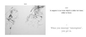
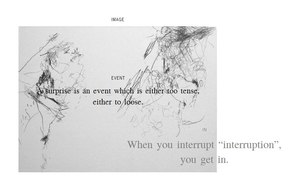
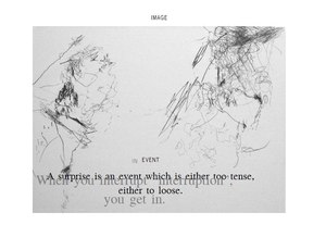
Here are some illustrations of the possibility to overlap boxes. I’ve made three boxes,
without frame
and
with a transparent background
It’s what you see on picture 1. Then I play with it (on picture 2 and picture 3)
(You could enlarge the pictures by clicking on them)
How to give the frame of the box another color?
Add this to the title of your box:
How to change the text-color of one word instead of the entire text?
eg: by Julien Bruneau
More colors?
For boxes, backgrounds, letters: you can use the full rgb-color scheme, by adding: {: style=’background-color: rgb(255, 0, 0). You can find RGB-color charts on the internet
Fond of the box title?
It is called ‘News Cycle’. Since it is linked on all the oralsite pages, all you need to do to use it is to do something like this add {: font-family=’News Cycle’ }
Additional question: Can the fond of the titles of the boxes be changed? Or is this part of the stylesheet?
It is part of the sylesheet but you can attach another stylesheet. There’s an entry on this page about adding stylesheets.
Background color of the entire page
Press the ‘edit’ button to edit the entire page and add the code of this page between the metadata and the first box.
This very page is an example of it. More precise colors can be defined by using the RGB color chart.
How to make the timeline invisible?
Press the ‘edit’ button to edit the entire page and add the following code between the metadata and the first box.
Add another stylesheet
Look at this page Stylesheet for an example
How to make invisible the division lines in a timed box?
You paste this code after each timing {: style=”border-top:none” } You can find examples in the walk + talk collection
FAQ to do with syntax
How to create a new page?
-
From an existing page: open double square brackets, give the page you want to create a title, close the double square brackets. Then click on the hyperlink you just created. The title of your new page will be the url of the page.
It is possible to change the title later (with the ‘pipeline’: Alt+shift+l), but not the url. -
From the url: add the name of your page after “sarma.be/oralsite/pages/…”
Remark: a new page has to start with a capital letter.
CAPITAL LETTERS for a new page
Is it correct that a page should always start with a capital letter? When you make a page with a small letter, it automatically gets saved as a capital letter, and in certain cases you then end up with two pages: one with a capital letter, and one with a small letter.
I could create pages starting with small letter, and even work on it, but if I go to the edit page then I actually arrive to the edit page of a page having the same name, but with capital letter. Even if I did not previously created such page. So the duplicates come from that point. Of course now, I use only capital letters but the other pages are still existing. They could be deleted.
How to create a collection page?
If your publication consists of several pages you might want to link them together with a ‘collection page’. You can create this ‘collection page’ via the metadata ‘Is part of’. Chose a name that is compatible with the structure of the url: you start with the capital letter. And signs like “+” will create errors. Blank spaces are possible.
An error-page?
This usually happens when you used a wrong syntax.
Eg: when you wanted to make a new section in a box by using the ##. If save the box without giving a title to this section, it will create an error. If you cannot go back to your page, add “…/edit” to the url of the page, and try to figure out what’s wrong in those pages. Cut out the part that you were working on last and try to save your page again. If that works, paste that part back in and check if you’ve made errors in the syntax before saving again.
the content of one box is appearing in another box?
We are aware of this problem… The best thing to do when you create a new box, is to give it a title, save it, and reload the entire page. This should stabilize the structure of the page. If it continues to happen, you can use the general ‘edit’ button in the left sidebar to work on the entire page. We know it’s not convenient…
the head of my box has dissappeared?
This sometimes happens when you tried to rescale your box by dragging. Click on the general ‘edit’ button in the left sidebar. Search for your box. You will see that it gives a negative value to the top position: “top: -…”. Change that negative value to “0” or another positive value. Save and drag the box to where you want it.
Embedding a url and overriding name of the url by another text?
eg: the hyperlink-text that you want to have appear
! don’t click on the link, but open this section of the box with the editing-symbol to see the code.
USING VIDEO’S FROM VIMEO OR YOUTUBE + CONNECTING THEM + SYCHRONIZING?
- On the Jonathan Burrows page, we embeded a video from youtube, but this uses another code than the embeding code we usually use for video. Is there a similar alternative for Vimeo?
If you watch a vimeo movie and put your cursor over it, you’ll see a “share” button. Click on it it will give you the code to paste. Share + Embed.
Additional problem: I COULDN’T CONNECT THE URL TO THE BOX WITH ANNOTATIONS. IN OTHER WORDS: I COULD NOT SYNCHRONIZE THE VIMEO-DRIVER WITH OTHER BOXES. Example url: http://sarma.be/oralsite/pages/Notes_on_Untitled
THIS IS CURRENTLY IMPOSSIBLE.. IT’S NOT EASY TO SOLVE. ALEX THINKS THAT GRADUALLY WEBSITES WILL GO BACK TO USING HTML INSTEAD OF THE FLASH INTERFACES. PERHAPS IT’S BETTER TO WAIT..
FAQ about other programs
Audacity
Converting
Videos need to have .ogv format. Use Fireogg to convert.
download Fireogg on your computer
open firefox, press ‘extra’, press ‘make a web-video’.
chose your file
chose the parameters: .ogv + the quality. Before I have used the middle quality. Was good enough, but depends also on your original video. There’s more paramaters if you want.
Sound needs to have the .ogg format. Use Zamzar or Audacity to convert.
embedding from vimeo or youtube
If you would like to embed a video from vimeo but are disturbed by the many buttons and info appearing on the image before you start to play it, you could solve this : on vimeo go to your video settings, then “embed”, you could adjust how you want it to be, save and get the “embed code” just above the preview of the embedded video.
In the future…
POSITIONING MATERIAL
http://www.researchcatalogue.net/view/18701/18702/0/323 —> if you move your arrow in the upper region, a menu appears, then move over “navigation”.
What is interesting about this publication (researchcatalogue) is that it works with boxes as well, but there is a grid-structure behind. The boxes are glued into the grid. This has the advantage that when you work on a different screen, the layout doesn’t get messed up.
In general Oral Site is now a very strong instrument for timing and synchronizing different sort of materials, but more poor when it comes to positioning the material. Eg: different layout on different screen size (YOU CAN USE PIXELS AND PERCENTAGES TO POSITION BOXES + Z-INDEX) Eg: the map —> scrolls diagonal Eg: plug in for next image, like a ‘slide show’ or ‘photo gallery’. Eg: how to make columns in a box, or glue several boxes together?
DURING OUR MEETING WE LOOKED AT EXAMPLES FROM INDESIGN (or the open-software variant). IT WOULD BE NICE TO ALLIGN AND DISTRIBUTE BOXES.
SEARCHING THROUGH TAGGING
When you start annotating a lot of research material (encyclopedia environment), you start missing ‘tags’ to find back materials, or make visible links between materials.
Additional questions: Do you tag within your subenvironment or within the whole of Oral site, or even broader (the general website of Sarma, or even websites that are built in the same way) = question of privacy. When your page is linked through tags, how to protect it when you’re still in research phase?
Research needed about the further use of tags: to find material, or to compose?
PRIVACY / STUDIO ENVIRONMENT FOR RESERACH INSTEAD OF PUBLICATION
Sound as driver versus annotation
flip photo option
Many website have this function. Is it possible to embed in Oral Site? This is option is really missed. PRIORITY!!
TESTPAGES on oral site
Lisa Nelson’s Disappearance
Test with the Essay of What’s the score
INTERESTING MODELS on other websites
Active Archives
For those interested in an example of customized output based on active archives: http://activearchives.org/aa/qna/Libre_Graphics_Meeting/ It is using the system in the back-end, but the page layout and functionalities are specific to this project.
Alternative for ‘map’
scrolling diagonally when you chose the option “map” in the meta-data. This is still not very practical. We should relook at this option I think. What is a map of a page? Here is an example Jeroen showed us, which is interesting: http://www.researchcatalogue.net/view/18701/18702/0/323 —> if you move your arrow in the upper region, an menu appears, then move over “navigation”. It’s really interesting!
What is interesting about this publication is that it works with boxes as well, but there is a grid-structure behind. The boxes are glued into the grid. This has the advantage that when you work on a different screen, the layout doesn’t get messed up.
In general Oral Site is now a very strong instrument for timing and synchronizing different sort of materials, but more poor when it comes to positioning the material. Eg: different layout on different screen size (YOU CAN USE PIXELS AND PERCENTAGES TO POSITION BOXES + Z-INDEX) Eg: the map —> scrolls diagonal Eg: plug in for next image, like a ‘slide show’ or ‘photo gallery’. Eg: how to make columns in a box, or glue several boxes together?
DURING OUR MEETING WE LOOKED AT EXAMPLES FROM INDESIGN (or the open-software variant). IT WOULD BE NICE TO ALLIGN AND DISTRIBUTE BOXES.
example Julien mentioned
www.arsindustrialis.org
layout-tools
http://hotglue.me/demo/
Problems with server?
If you your files are not loading this might have to do with a server-problem. First try to reboot the server. If this doesn’t help, it might mean that we have to clear space on the server. Please contact Sarma.
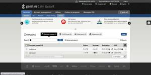
YOU HAVE TO CHECK THE DISK SPACE, BUT IT’S NOT POSSIBLE TO SEE IT VIA THE GANDI-WEBSITE. ALEX WILL INSTALL A PUP-UP ON ORAL SITE, SO THAT WE KNOW WHEN THE DISK IS FULL.
Reboot the server
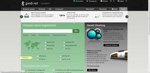
- Surf to: http://en.gandi.net/?lang=en
You have now rebooted the Sarma server. Wait for 5 minutes.
Questions for Alex, Jan2013
Un-editable box, buggy pages
eg. on the page http://sarma.be/oralsite/pages/Walk_+_talk/ Also this Editors-page. Code gets messed up automatically
Server
Can we delete video, audio, images that is not used anymore?
Meeting aug2012: ALEX WILL INSTALL A POP-UP ON ORAL SITE, SO THAT WE KNOW WHEN THE DISK IS FULL. + ALEX WILL DELETE + PREVENT BACK-UPS THAT ARE ALREADY ON THE SITE.
Audacity
Importing exporting works again? Yes. Another problem to do with these arrows: visitors of the page press on these arrows. They either get an error-page, or a login-page. The function of these errors are not clear, if you don’t know what Audacity is.
Layout unordered lists
- The unordered lists give a very ugly dash, it used to be different I think.
- Alex: It is not that nice with paragraphs indeed. I’ll see why after I come back.
Automatic play
Is there a code-extension to have the general timeline play automatically as soon as you arrive on a page?
Alex: I don’t remember exactly, I need to check.
Timeline in cinematic mode
when I am watching in cinematic mode and I want to jump to a next ‘material’ by clicking on the blue line (we call it the blue dna of the page) nothing happens. So, through that I apparently cannot skip/jump. It works of course when I drag the play button forward, but it would be great if the dna-blue print worked out also.. any explanations for that?
working with another graphic designer?
What does he/she needs to work on the back-end-code? For now: we have to plan ahead on what we want to work, bring the graphic designer in contact with Alex, so that he can give more precise instructions where to find what, what is changeable,…
history
Sometimes the history doesn’t load.
Is it still the case that every single move of a box creates a history?
Pop-up note about which version of Firefox!
Absolutely necessary, too many people get stuck.
Metadata: authors
This information doesn’t appear anymore in the left column. Where to place the editors?
Metadata: googlesearch
- If you google Oral Site, google suggests a few pages in the sub-search. One entry is Oral Site, but when you click: you arrive on one particular page of Sarma-documentation. How to add metadata-keywords to the individual pages, so that google can do more precise suggestions?
top bar for the timeline
By default it is open, but can it also be closed as default?
Active Archives
The title of a webpage says: Active Archives. It’s confusing. It would be better if it said: Oral Site
Lay-out of walk + talk
- Can we make an extra line in the subtitles-metadata-field? walk + talk —> strange “+” sign… how to centre an image in the background? (eg: http://sarma.be/oralsite/pages/Walk_+_talk/) - Where exactly do you paste the code to make the timings in a box invisible? [property=”aa:start”], [property=”aa:end”] { display: none; }
- how can you vary the size/position of boxes - depending on cinematic or canvas. We worked on this last year, but I have no notes from it. Can we make an example on a page?


